ux case study
click-throughs improved 363% in a week
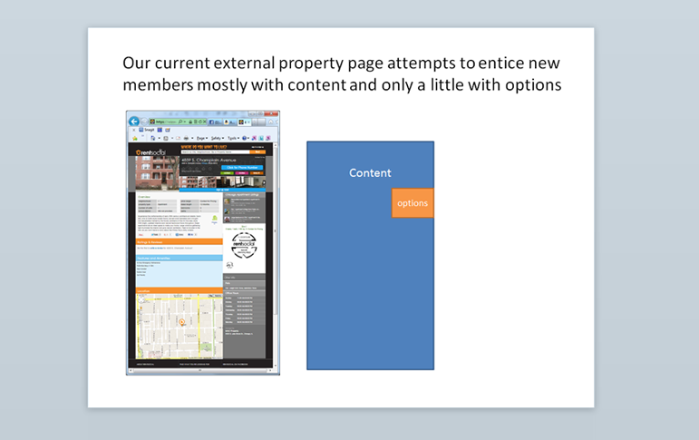
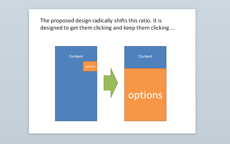
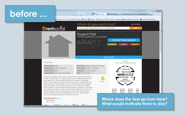
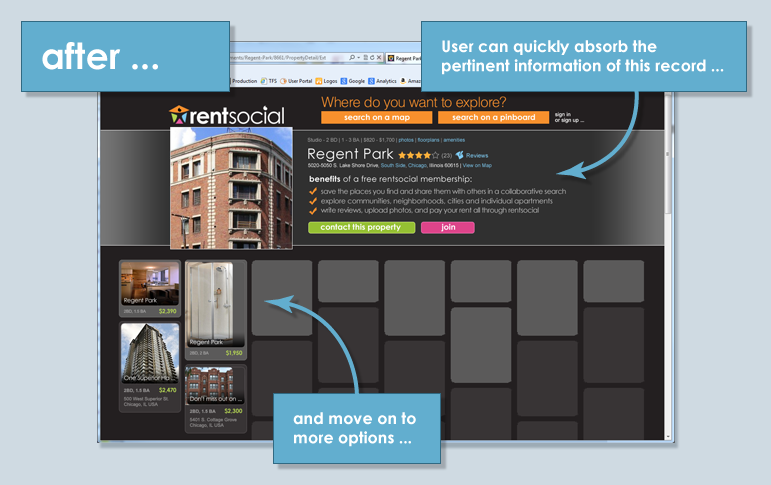
When the executive stakeholders on my team discovered sexy color schemes and jazzy layouts wouldn't save them from metrics which consistently showed a high User drop-off rate on a particular page, I suggested we give these Users somewhere to go next, instead of forcing them to back up. Instead of showing them EITHER a series of options OR the full record of just one option, I redesigned the screen to show BOTH in more equal measures. In just a week of A/B testing, click-throughs to successive options had improved a whopping 363%. Usability you can take to the bank is everyone's favorite usability.
read more/less